ShopDreamUp AI ArtDreamUp

Deviation Actions


Suggested Deviants


Suggested Collections


You Might Like…


Featured in Groups


Description
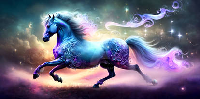
High on a fever
Somebody heal me from my pain
I'm reaching closer
My stars dive lower
Filling up lost memories
Holes in the sky
Pierced by the fire
Somebody tell me this is real
Description
I made this based off the song holes in the sky by M83
i decided to be ambition
and I'm honestly super happy with the outcome. I'm glad I challenged myself
(p.s. if you critique this i will love you forever <3)
Technical information
Layers; 80 (wow)
Time; over ten hours
Tools; GIMP, wacom intuos touch large.
Credits
barn owl||Bald Eagle 8||horse rolling stock 8||sky III||Clouds Above 3||Clouds Above
(c)EquineLullaby
Image size
4000x2667px 6.82 MB
© 2015 - 2024 Lullivy
Comments34
Join the community to add your comment. Already a deviant? Log In
First of all, the overall effect of this is stunning! I really like the lighting on this- you've nailed the way that the horse is reflecting the blue of the sky in the areas that aren't in the direct light source. I find that that is something that lots of people struggle to do, but it adds a huge amount of realism to the piece, and you've demonstrated that here.
The first thing I notice in this piece is that the horse looks like it is being crowded; you've painted the mane and forelock directly over the horse's face and neck, so we lose out on some details. I would suggest that making the mane shorter would probably be the easiest solution in this case, but the best thing to do would be to change the flow of the mane(the tail may also benefit from this too). Whilst the hair is flowing in the direction that you have suggested in this piece, everything looks a little 'blocky' and lacks movement.
To remedy this, the best thing to remember is that horse hair flows in little clumps- it separates and moves in lots of different directions, even though the general 'flow' of the mane is in one direction. I hope that makes sense? If not, let me know and I'll explain better, haha.
I would also say that your mane and tail could do with it bit more structure in the lighting. By this I mean that when painting your hair, the best thing to do is to paint in some big strands of highlights, and some big areas in shadow, and then build off of this to give your mane more depth and tone. I would try and explain more, but this tutorial is better at it than me, haha. twistyh-stock.deviantart.com/a…
When zoomed out, your cutting and prep looks fairly neat, but when zoomed in, I can see that the cutting around the hindquarters and right wing is quite choppy, and the painting on the wing could be smoother. I think Bright-Button already mentioned that the wing could also benefit from being erased around the edges? This is simply because the wings would be thinner around the edges. Another good way to get definition and sharpness in your wings is really simple; all that you need to do is out line them with a small, light coloured hard edged brush, and it will instantly add some more detail. From there, you could build off it, and add shadows where the light isn't being hit etc.
The last few suggestions I have aren't things that are really technically wrong with the picture, just things that I think could be added to give it a bit more 'wow' factor c: First thing I would say is that the landscape background could be changed to portrait, to make the horse instantly be the centre of attention. The other thing I thought of would be to perhaps add some clouds to the foreground of the image? This would give the image a bit more depth, and they could be sort of framing the horse to ,again, make it the centre of attention.
I'm sorry this is really long, but I hope it can help you! If you have any questions, please ask, and I'd be happy to answer them. c: Also, please don't feel like because I dumped a load of criticism on you that I think your art isn't good! This piece is a real testament to your development and growth as an artist; it is by far your best work in your gallery, and really shows how much your lighting and other elements such as horse prep, wing blending and hair painting have improved. This really is a piece you should be proud of, and I can't wait to see more of your work in the future! <img src="e.deviantart.net/emoticons/t/t…" width="40" height="18" alt="